


To evaluate the regression model, there are many other interrelated contradictory approaches. Whenever the predicted output is a continuous as well as a cumulative value, it is referred to as a prediction model. Numerous other approaches can be employed. The most basic of which is the linear model. It integrates the values to the optimal higher dimensional space that passes through all of the vertices. The regplot() function is used to create the regression plots.
Regression Analysis is a technique used for evaluating the associations between one or more independent factors or predictors and the dependent attributes or covariates. The variations in the requirements in correlation to modifications in specific determinants are analyzed through the Regression Analysis. The criteria’s declarative requirement is dependent on the indicators, which give the new value of the dependent attributes whenever the data points are updated. Evaluating the intensity of covariates, anticipating an outcome, and estimating are the three important applications of a regression model.
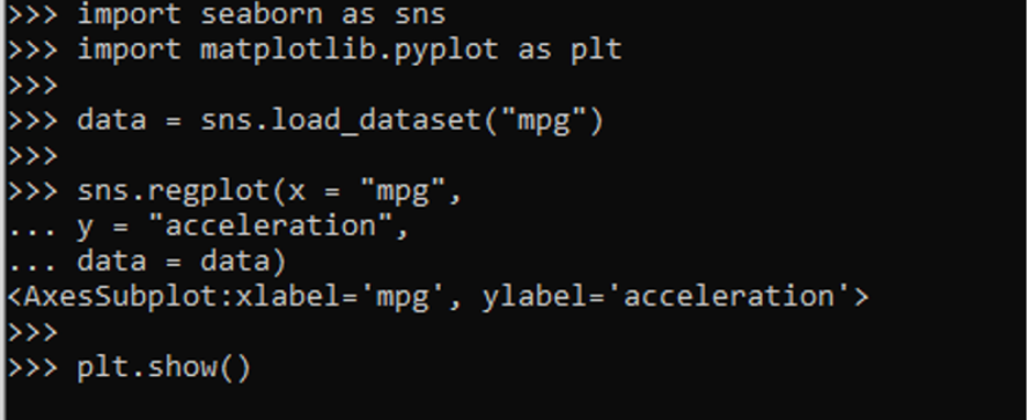
Example 1
In this step, we use the regplot() method to draw the regression plot of the data frame “mpg”.
import matplotlib.pyplot as plt
data = sns.load_dataset("mpg")
sns.regplot(x = "mpg",
y = "acceleration",
data = data)
plt.show()
At the start of the program, we imported the required frameworks, Seaborn and matplotlib.pyplot. Seaborn is a Python module for creating numerical visuals. It is effectively correlated to the matplotlib library. Seaborn library assists users in accessing and evaluating the data. Among the most widely utilized modules for data analysis is Matplotlib. This library is a cross-platform package that creates two-dimensional charts using a range of data. It includes an Interface for integrating graphs in Python Graphical framework based on applications.
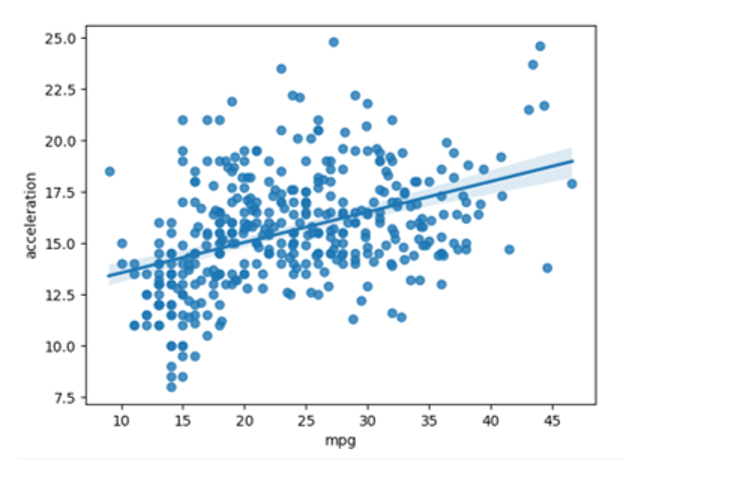
Here, we get a dataset of “mpg” by applying the load_dataset() method. This method is taken from the Seaborn library. The regplot() function is employed to draw the regression plots. The Seaborn module contains the regplot() function. This method contains three parameters. The x-axis of the histogram holds the values of mpg. Whereas the y-axis of the regression plot holds the values of acceleration. In the end, we use the plt.show() function to represent the plot.
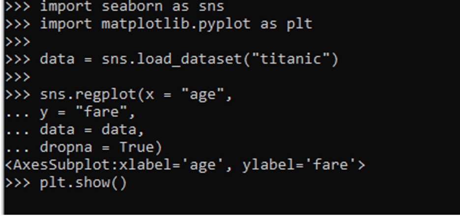
Example 2
Another visualization method of plotting the regression plot is by applying the regplot() method. Here, we employ this method on the “titanic” data set.
import matplotlib.pyplot as plt
data = sns.load_dataset("titanic")
sns.regplot(x = "age",
y = "fare",
data = data,
dropna = True)
plt.show()
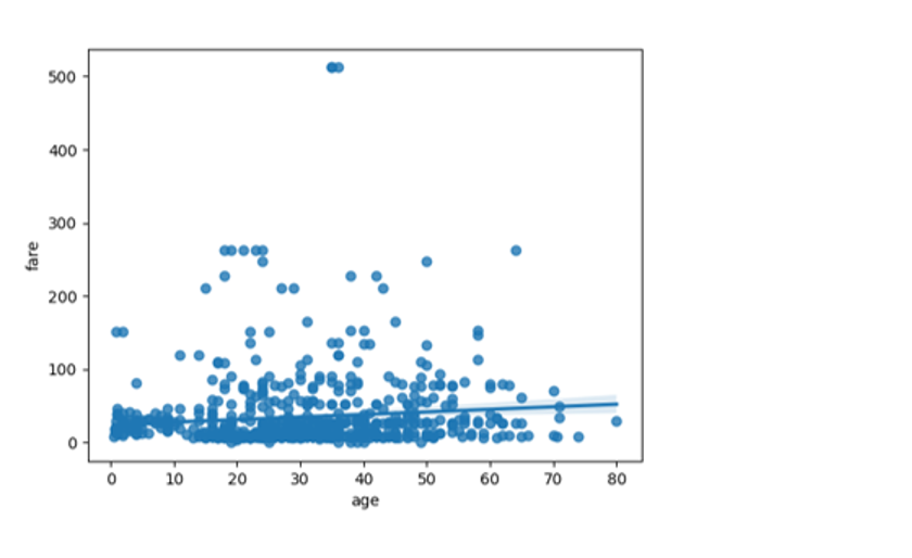
First of all, we integrate the header files. The Seaborn library is integrated as sns and matplotlib.pyplot is integrated as plt. In the next step, we load the required data frame so, we apply the load_dataset() method. This function contains the “titanic” parameter as we want the dataset of the titanic. The Seaborn package holds the function of load_dataset(). In the following step, we utilize the regplot() function. This function creates the regression visual of the titanic dataset. The function contains different arguments including the data, the value of the x-axis, y-axis, data, and dropna.
Here, we provide the value of the “dropna” attribute. By specifying the “dropna” parameter to True, we may insert a curvature to a plot. The x-axis of the regression map is labeled as “age” and the y-axis is labeled as “fare”. The plt.show() method is applied to illustrate the resultant graph.
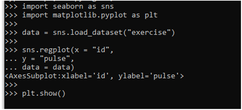
Example 3
The regplot() method of the Seaborn library can also be used to create a regression plot. In this case, we create a regression plot of the data set “exercise”.
import matplotlib.pyplot as plt
data = sns.load_dataset("exercise")
sns.regplot(x = "id",
y = "pulse",
data = data)
plt.show()
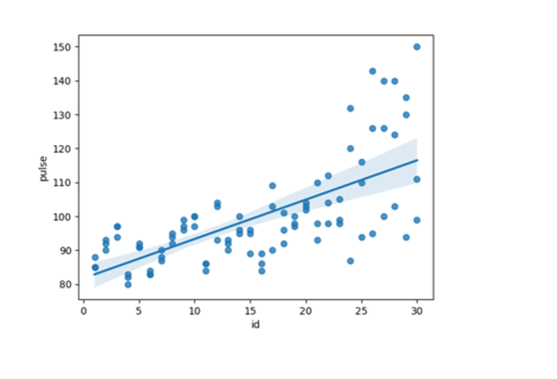
Here, we introduce the essential libraries, Seaborn as sns and matplotlib.pyplot as plt. We apply the load_dataset() function of the Seaborn module to acquire the “exercise” data. The gathered data is saved in the “data” attribute. The regression plot is created by using the regplot() method. This method is found in the Seaborn package. This method has a variable that represents the id, pulse, and data of the graph. Lastly, to depict the plot, we employ the plt.show() method.
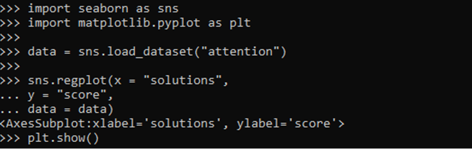
Example 4
In this instance, the regplot() method specifies a data set of “attention” and values of both the x-axis and y-axis.
import matplotlib.pyplot as plt
data = sns.load_dataset("attention")
sns.regplot(x = "solutions",
y = "score",
data = data)
plt.show()
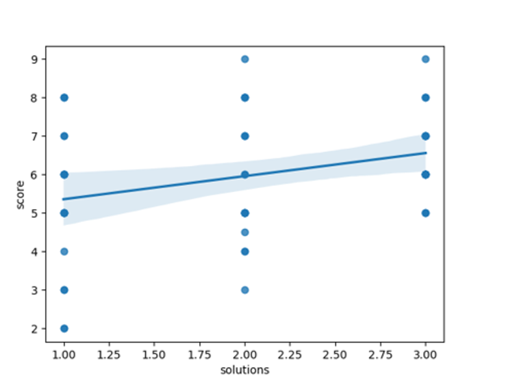
We start by integrating the packages sns and plt. The seaborn library is incorporated as sns. Matplotlib is used to integrate plt. We now retrieve the appropriate data set. As a result, we use the load_dataset() function. If we want a database of attention, this method has an “attention” argument. The load_dataset() method is part of the Seaborn package.
After this, the regplot() method of the Seaborn module is applied. This module creates the regression plot. The function takes the several parameters such as data, x-axis value, and y-axis value. The regression map’s x-axis is marked as “solutions” and the y-axis is marked as “score”. The obtained regression plot is then visualized by using the plt.show() function.
Conclusion
In this article, we talked about the numerous methods of creating the regression plots in Seaborn. We utilized the regplot() method to draw the regression plots. Furthermore, we drew regression graphs of the different inbuilt data sets of Seaborn. The regression visualizations in the Seaborn package are designed exclusively to provide a visual aid for highlighting the features from the set of data during the data exploration. As the name implies, a regression map draws a regression boundary between two variables and aids in the depiction of the underlying correlation coefficients.
from https://ift.tt/GHFqNJD


0 Comments