


Heatmaps are used to display patterns, variance, and anomalies, as well as to depict the saturation or intensity of the variables. Relationships between variables are depicted via heatmaps. Both axes are used to plot these variables. By observing the color shift in the cell, we can look for the patterns. It only takes numerical input and shows it on the grid, with different data values displayed by the varying color intensity.
Many various color schemes can be used to depict the heat map, each with its own set of perceptual advantages and disadvantages. Colors in the Heatmap indicate patterns in the data, thus the color palette decisions are more than just cosmetic. The finding of patterns can be facilitated by the appropriate color palettes but can also be hindered by the poor color choices.
Colormaps are used to visualize heatmaps since they are a simple and effective way to see data. Diverse colormaps could be utilized for different sorts of heatmaps. In this article, we’ll explore how to interact with Seaborn heatmaps using the colormaps.
Example 1: Set the Sequential Colormaps Plot
When the data values (numeric) change from high to low and just one of them is significant for the analysis, we utilize the sequential colormaps. Note that we created a colormap with sns.color palette() and displayed the colors in the colormap with sns.palplot(). The following instance explains how to generate a sequential colormap heatmap with the Seaborn module.
In the following python script, we provide the three modules that are necessary for the code to work. Then, we insert the seed value zero into the random function for generating random numbers. We create the field data where the rand function is called that generates a random number in a specified interval for the x-axis and y-axis. Then, we create a colormap variable where the color_palette created the color “Reds”. In the end, the cmap color is utilized for the heatmap.
import seaborn as sns
import numpy as np
np.random.seed(0)
data = np.random.rand(10, 10)
colormap = sns.color_palette("Reds")
ax = sns.heatmap(data, cmap=colormap)
plt.show()
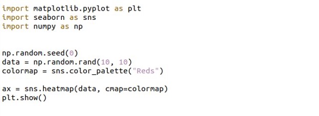
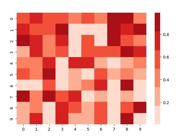
The sequential color heatmap is represented like this from the previous script.
Example 2: Set the Sequential Colormaps with the Cmap Argument Plot
As “Reds” is a built-in colormap in seaborn, it can also be passed straight to the cmap argument.
It’s worth noting that our colormap has a continuous color intensity, as opposed to the previous one, which had a discrete green intensity for a range of possible values. Here’s a deeper look at the colormaps obtained in the heatmaps mentioned in the following illustration:
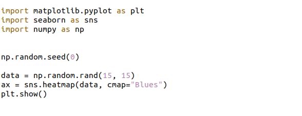
We passed a zero for the rand seed and generated the random number by using the rand function inside the variable data. We set the interval (15,15) for both the x-axis and the y-axis. Then, we passed an argument cmap which has the color “Blues” inside the heatmap function. This creates the “Blue” color variations of the heatmap.
import seaborn as sns
import numpy as np
np.random.seed(0)
data = np.random.rand(15, 15)
ax = sns.heatmap(data, cmap="Blues")
plt.show()
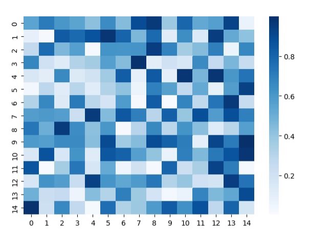
The Blues’ sequential color intensity plot is shown inside the figure along with the color bar of the specified color.
Example 3: Set the Diverging Colormaps Plot
They’re utilized to depict the numeric values that range from high to low (and vice versa), with both the maximum and minimum values being important. On a Seaborn heatmap, the following example explains how to use a diverging colormap.
Here, we import the Seaborn library which is installed in our python language. The Matplotlib library is also used for the visualization of the plot. We have another module which is NumPy for the NumPy features. Then, by utilizing the NumPy module, we have the np.random.seed function which passes a value of zero used to initialize the random numbers.
Inside the variable data, we call a NumPy function rand which set the number limit for both the axes in the plot. Then, we have a Seaborn heatmap function, which takes the argument cmap. The cmap is set with the default color scheme which is the coolwarm colors.
import seaborn as sns
import numpy as np
np.random.seed(0)
data = np.random.rand(10, 12)
ax = sns.heatmap(data, cmap="coolwarm")
plt.show()
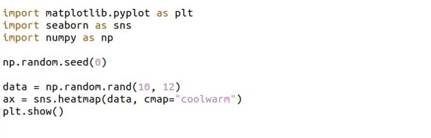
In the following figure, we have a customized heatmap using cmap:
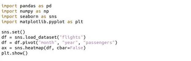
Example 4: Set the Cbar Parameter Plot
The heatmap’s cbar attribute is a Boolean value that implies whether it should be plotted. The color bar is featured in the graph by default if the cbar parameter isn’t specified. Switch the cbar to False to disable the color bar. The cbar=False parameter in the heatmap() method can be used to disable the colorbar of the heatmap in Seaborn.
We required the four libraries; the additional library is the pandas for the data frame which we utilize in the code. With the Seaborn, we call a set function here. Then, with the loaded dataset function, the sample dataset flights are added and stored in the df variable.
In the next line, we have a pivot function that takes the column-wise data and groups the data accordingly. We pass the three columns: months, year, and passengers from the flight’s dataset. Now, invoking the seaborn heatmap function sets the cbar argument to a false value. With the plt show function, the plot is rendered.
import numpy as np
import seaborn as sns
import matplotlib.pyplot as plt
sns.set()
df = sns.load_dataset("flights")
df = df.pivot("month", "year", "passengers")
ax = sns.heatmap(df, cbar=False)
plt.show()
The cbar is removed from the heatmap plot in the given figure:
Conclusion
It’s simple to work with the Seaborn heatmaps. We discussed the two types of color maps which include the sequential and diverging color maps. We explained them briefly along with the running example with the Python Seaborn compiler inside the Ubuntu 20.04.
from https://ift.tt/fY0yW85


0 Comments