If you are a data scientist, then sometimes you have to handle the big data. In that big data, you are processing the data, analyzing the data, and then generating the report on that. To generate the report on that, you must need some clear image of the data, and here the graphs come in place.
In this article, we are going to explain how to use the matplotlib scatter plot in python.
The scatter plot is widely used by data analytics to find out the relationship between two numerical datasets. This article will see how to use the matplotlib.pyplot to draw a scatter plot. This article will give you complete details which you need to work on the scatter plot.
The matplotlib.pypolt offers different ways to plot the graph. To plot the graph as a scatter, we use the function scatter ().
The syntax to use the scatter () function is:
All the above parameters, we will see in the coming examples to understand better.
plt.scatter(x_data, y_data)
The data we passed on the scatter x_data belongs to the x-axis, and y_data belongs to the y-axis.
Examples
Now, we are going to plot the scatter () graph using different parameters.
Example 1: Using the default parameters
The first example is based on the default settings of the scatter () function. We just pass two datasets to create a relationship between them. Here, we have two lists: one belongs to the heights (h), and another corresponds to their weights (w).
# import the required library
import matplotlib.pyplot as plt
# h (height) and w (weight) data
h = [165, 173, 172, 188, 191, 189, 157, 167, 184, 189]
w = [55, 60, 72, 70, 96, 84, 60, 68, 98, 95]
# plot a scatter plot
plt.scatter(h, w)
plt.show()
Output: scatter_default_arguments.py
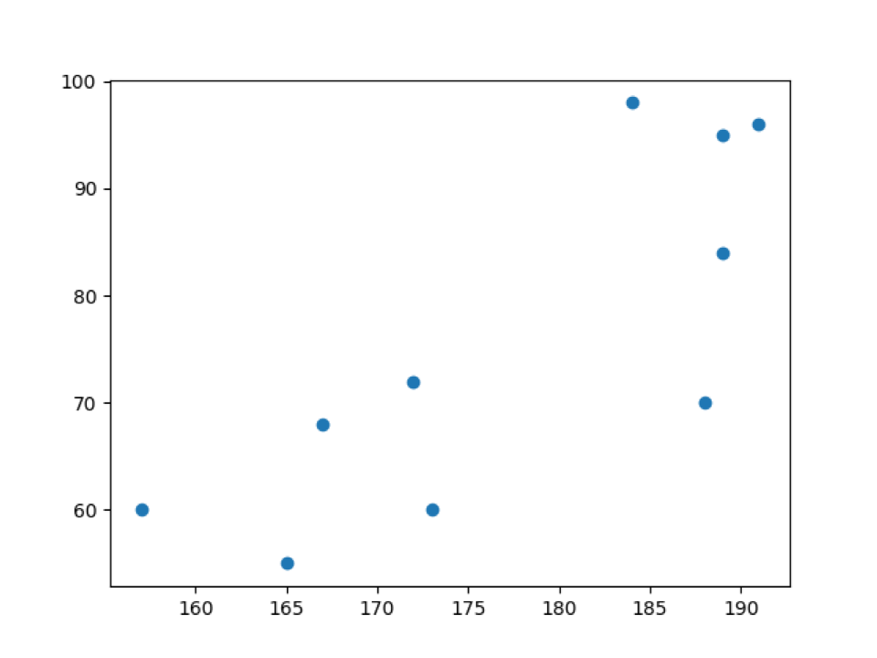
In the above output, we can see the weights (w) data on the y-axis and heights (h) on the x-axis.
Example 2: Scatter () plot with their labels values (x-axis and y-axis) and title
In example_1, we just draw the scatter plot directly with default settings. Now, we are going to customize the scatter plot function one by one. So, first of all, we will add labels to the plot, as shown below.
# import the required library
import matplotlib.pyplot as plt
# h and w data
h = [165, 173, 172, 188, 191, 189, 157, 167, 184, 189]
w = [55, 60, 72, 70, 96, 84, 60, 68, 98, 95]
# plot a scatter plot
plt.scatter(h, w)
# set the axis lables names
plt.xlabel("weight (w) in Kg")
plt.ylabel("height (h) in cm")
# set the title of the chart name
plt.title("Scatter plot for height and weight")
plt.show()
Line 4 to 11: We import the library matplotlib.pyplot and create two datasets for the x-axis and y-axis. And we pass both datasets to the scatter plot function.
Line 14 to 19: We set the x-axis and y-axis label names. We also set the title of the to scatter plot graph.
Output: labels_title_scatter_plot.py
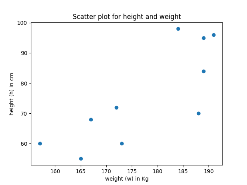
In the above output, we can see that the scatter plot has axis label names and the scatter plot title.
Example 3: Use marker parameter to change the style of data points
By default, the marker is a solid round, as shown in the above output. So, if we want to change the style of the marker, we can change it through this parameter (marker). Even we can also set the size of the marker. So, we are going to see about this in this example.
# import the required library
import matplotlib.pyplot as plt
# h and w data
h = [165, 173, 172, 188, 191, 189, 157, 167, 184, 189]
w = [55, 60, 72, 70, 96, 84, 60, 68, 98, 95]
# plot a scatter plot
plt.scatter(h, w, marker="v", s=75)
# set the axis lables names
plt.xlabel("weight (w) in Kg")
plt.ylabel("height (h) in cm")
# set the title of the chart name
plt.title("Scatter plot where marker change")
plt.show()
The above code is the same as explained in the previous examples except for the below line.
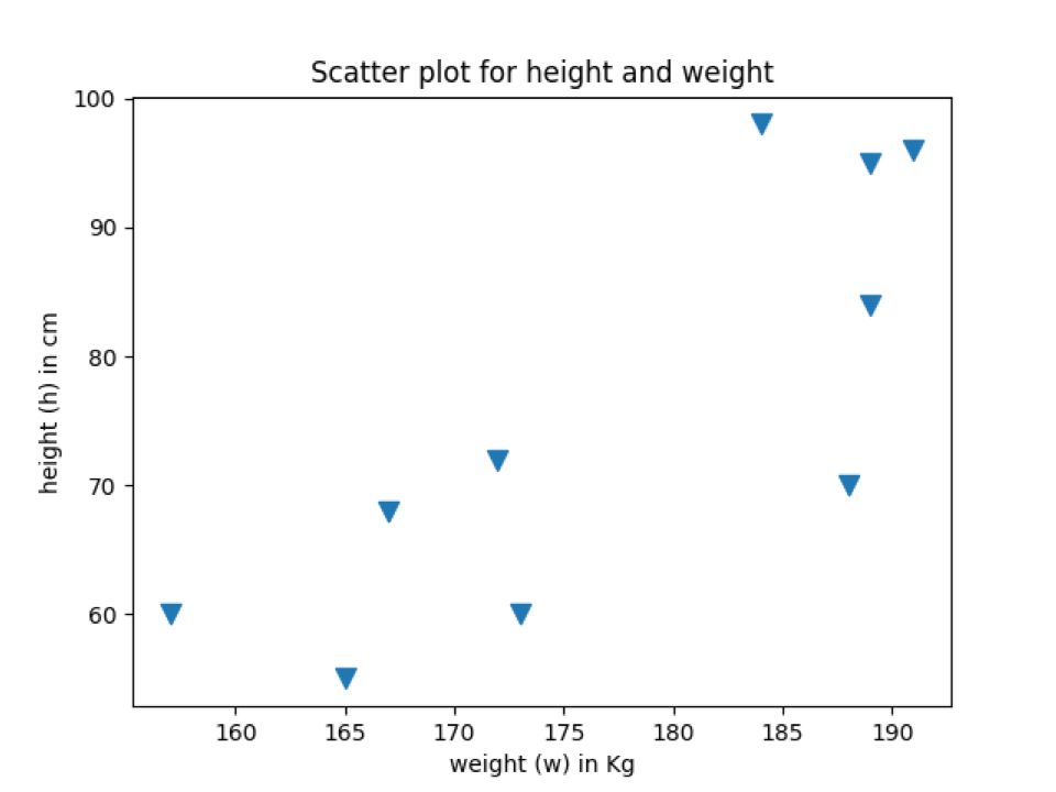
Line 11: We pass the marker parameter and a new sign used by the scatter plot to draw points on the graph. We also set the size of the marker.
The below output shows data points with the same marker which we added in the scatter function.
Output: marker_scatter_plot.py
Example 4: Change the colour of the scatter plot
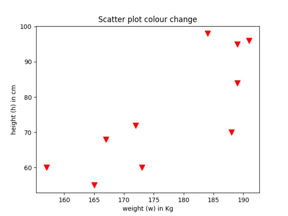
We can also change the colour of the data points according to our choice. By default, it shows with blue colour. Now, we will change the colour of the scatter plot data points, as shown below. We can change the colour of the scatter plot using any colour which you want. We can choose any RGB or RGBA tuple (red, green, blue, alpha). Each tuple element’s value range will be between [0.0, 1.0], and we can also represent the RGB or RGBA in the hexadecimal format like #FF5733.
# import the required library
import matplotlib.pyplot as plt
# h and w data
h = [165, 173, 172, 188, 191, 189, 157, 167, 184, 189]
w = [55, 60, 72, 70, 96, 84, 60, 68, 98, 95]
# plot a scatter plot
plt.scatter(h, w, marker="v", s=75,c="red")
# set the axis lables names
plt.xlabel("weight (w) in Kg")
plt.ylabel("height (h) in cm")
# set the title of the chart name
plt.title("Scatter plot colour change")
plt.show()
This code is similar to the previous examples, except the below line where we add the colour customization.
Line 11: We pass the parameter “c,” which is for the colour. We assigned the name of the colour “red” and got the output in the same colour.
If you like to use the colour tuple or hexadecimal, then just pass that value to the keyword (c or color) like below:
In the above scatter function, we passed the hexadecimal colour code instead of the colour name.
Output: scatter_plot_colour.py
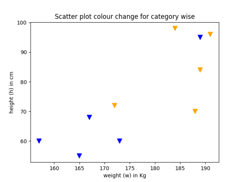
Example 5: Scatter plot colour change according to the category
We can also change the colour of the data points according to the category. So in this example, we are going to explain that.
# import the required library
import matplotlib.pyplot as plt
# h and w data gather from two country
h = [165, 173, 172, 188, 191, 189, 157, 167, 184, 189]
w = [55, 60, 72, 70, 96, 84, 60, 68, 98, 95]
# set the country name 1 or 2 which shows the height or weight
# data belongs to which country
country_category = ['country_2', 'country_2', 'country_1',
'country_1', 'country_1', 'country_1',
'country_2', 'country_2', 'country_1', 'country_2']
# color mapping
colours = {'country_1':'orange', 'country_2':'blue'}
colour_list = [colours[i] for i in country_category]
# print the colour list
print(colour_list)
# plot a scatter plot
plt.scatter(h, w, marker="v", s=75,c=colour_list)
# set the axis lables names
plt.xlabel("weight (w) in Kg")
plt.ylabel("height (h) in cm")
# set the title of the chart name
plt.title("Scatter plot colour change for category wise")
plt.show()
The above code is similar to the previous examples. The lines where we did changes are explained below:
Line 12: We put the whole data points either in the category of country_1 or country_2. These are just assumptions and not the true value to show the demo.
Line 17: We created a dictionary of the colour which represents each category.
Line 18: We map the country category with their colour name. And the below print statement will show results like this.
Line 24: At last, we pass the colour_list (Line 18) to the scatter function.
Output: colour_change_by_category.py
Example 6: Change the edge colour of the data point
We can also change the edge colour of the data point. For that, we have to use the edge colour keyword (“edgecolor”). We can also set the line width of the edge. In the previous examples, we did not use any edgecolor, which is by default None. So, it does not show any default colour. We will add edge colour on the data point to see the difference between the previous examples scatter plot graph with the edge colour data points graph plot.
# import the required library
import matplotlib.pyplot as plt
# h and w data
h = [165, 173, 172, 188, 191, 189, 157, 167, 184, 189]
w = [55, 60, 72, 70, 96, 84, 60, 68, 98, 95]
# plot a scatter plot
plt.scatter(h, w, marker="v", s=75,c="red",edgecolor='black', linewidth=1)
# set the axis lables names
plt.xlabel("weight (w) in Kg")
plt.ylabel("height (h) in cm")
# set the title of the chart name
plt.title("Scatter plot colour change")
plt.show()
Line 11: In this line, we just add another parameter which we call edgecolor and linewidth. After adding both the parameters, now our scatter plot graph looks like something, as shown below. You can see that the outside of the data point is now bordered with the black colour with linewidth = 1.
Output: edgecolour_scatterPlot.py

Conclusion
In this article, we have seen how to use the scatter plot function. We explained all the major concepts required to draw a scatter plot. There might be some other way to draw the scatter plot, like some more attractive way, depending on how we use different parameters. But most of the parameters we covered were to draw the plot more professionally. Also, do not use too many complex parameters, which can confuse the actual meaning of the graph.
The code for this article is available at the below github link:
https://github.com/shekharpandey89/scatter-plot-matplotlib.pyplot
from Linux Hint https://ift.tt/3iXhY4E


0 Comments