


The logo is what gives an identity to a brand or a new start-up. Nowadays, even retail stores have their own logos. Many applications provide custom templates for easy logo making. But when it comes to original logos, Photoshop can be a better choice. Photoshop was developed for manipulating the images. However, it still can be used to scale logos without any loss in quality.
This article is going to guide you in creating a logo using Photoshop.
Here are the following steps:
Creating a Logo in Photoshop
Creating a company logo in Photoshop requires multiple steps. So, I will be categorizing the whole process into steps to make it easy to understand.
Creating a New Document
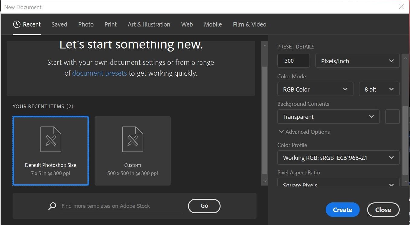
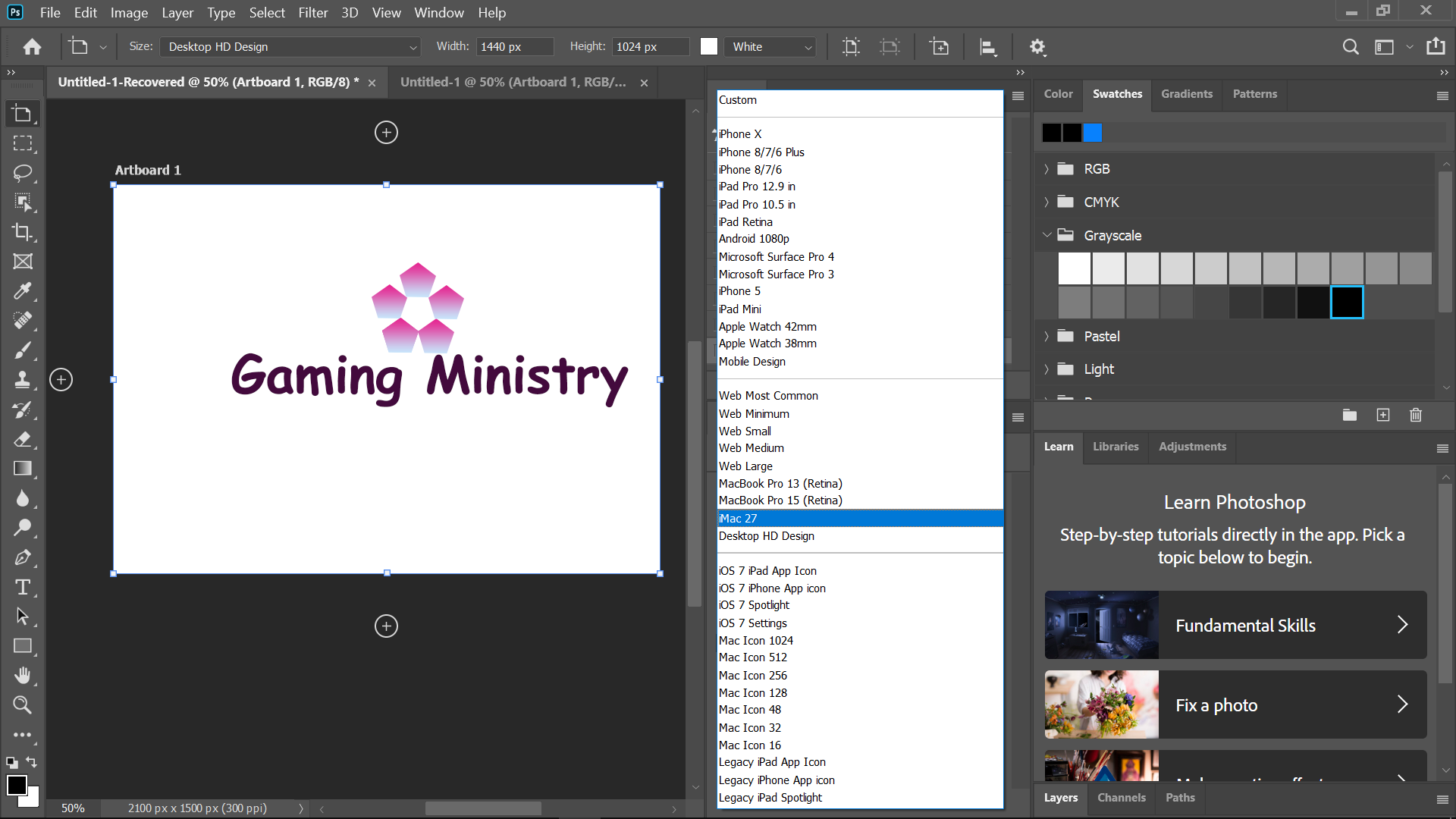
First, you are required to create a new document to play with. Create a new document by navigating to the file menu given at the top of the window and clicking on “New”. You can define the dimensions according to your requirements. I have chosen the default template as my requirements match it. Also, don’t forget to set the background as transparent.
Adding Layers to the Canvas
Adding layers to elements in the canvas helps in solving mistakes and editing while finalizing the logo. Go to the right-bottom of the window to add a new layer, or you can use the shortcut Shift+Ctrl+N.
Choosing Artworks for Your Logo
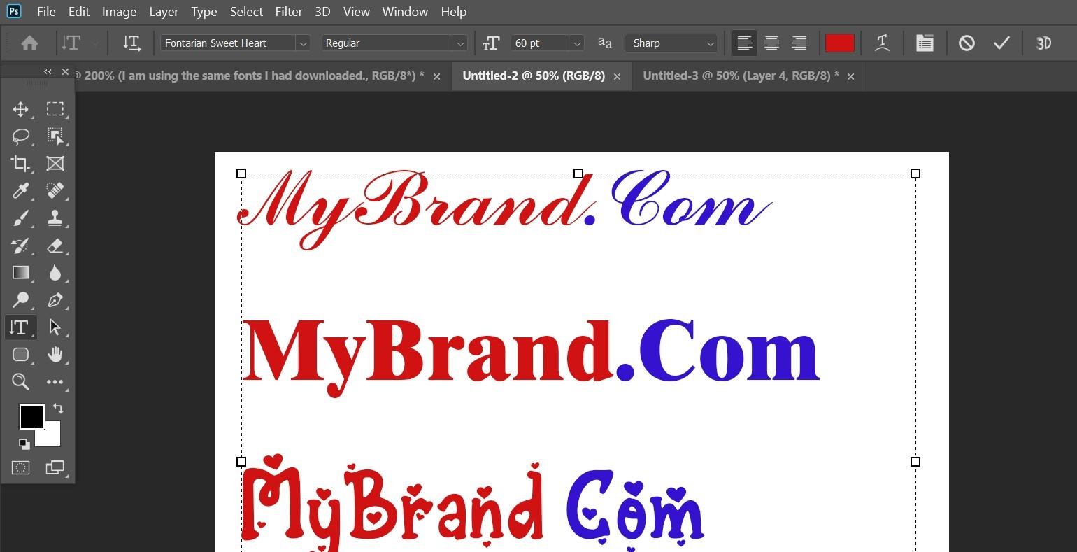
Since you are at the learning stage, creating artwork on your own will be a hectic task for you. The majority of non-professional users create logos on their own using the text-only logos for their brand. You can use fancy fonts and different colors to make it look better. Other than that, you can also use pre-made vectors by downloading them. However, make sure you use copyright-free vectors.
Adding Effects to the Text
No need to worry if you are merely a beginner and creating a text logo on your own. Text logos can be made attractive by adding different types of effects to the layer.
Adding Strokes to the Text
Select the text and click on the layers TAB given in the taskbar. Navigate to the Layer style menu and click on the Strokes option. Here, you can select the stroke colors, opacity, blend mode size, etc.
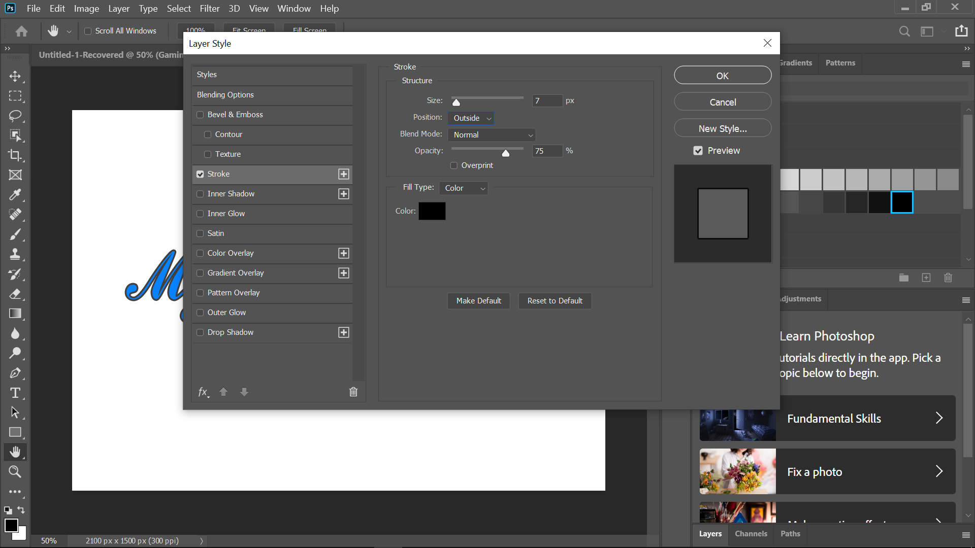
From the same window, you can add multiple effects to your text, such as overlay, glow, gradient, shadows, and contour.
Gradients make your logo look cool and attractive. I have added white and grey gradients with black strokes in the simple sample text logo shown below.

Adding Basic Shapes to the Logo
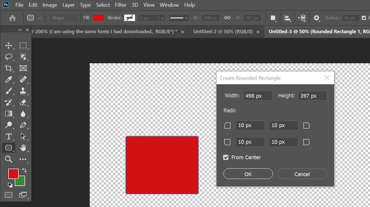
Using shapes in a logo can be the best way to represent your business. However, I won’t recommend the 3D shapes. Use the 2D shapes instead. You can add a variety of shapes using the Shape tool. You can select the Shape tool from the side toolbar. Other than that, you can select the shape properties from the menu bar at the top.
Arranging the Elements of Logo
After you have added the shape to your canvas, you need to arrange them as per your design. Given below is an example of selecting a polygon shape and aligning it per design requirements. For duplicating a shape, you can use the command alt+j and drag them using the Direct Selection tool.

For adding colors and gradients to the design, navigate to the taskbar on the right side and choose the appropriate colors, gradients, and textures.
Always add some characters to your logo so that it becomes easier for people to distinguish your brand.
Checking Logo on Artboard
Artboard in Photoshop allows you to have multiple design layouts from a single document. You can check your design compatibility/visibility in accordance with different devices. You can open the Artboard tool by holding on to the Move tool or by right-clicking on it.
What Colors Should I Use in My Company Logo?
The Psychology of colors plays an important role in logos. You should always choose colors that can relate to your business. You can go for multiple colors while designing a logo but don’t overdo it. Two to three colors are more than enough. Always choose the colors of the design with the target audience and market in mind.
I am listing out the significance of several colors and what they mean:
Red
The red color is usually known for passion, aggression, and attention. If your brand is youthful and modern, you can go for red color. I won’t suggest a red color for classic and serious businesses. Businesses dealing with fast food can have a red color in their logos.
Yellow
Yellow color in logos represents accessibility, energy, and friendliness. Since the yellow color has multiple shades, you can choose a shade per the priority of your business.
Green
The green color represents growth, money, and diversity. In some places, green color is also known to reflect death. You can use green color in your logo if it is about culture, nature, or resources.
Blue
Blue color reflects trust, depth, and maturity. Brands use the blue color to show confidence and authority. If your business is service-oriented, then you go for a logo with blue color.
Orange
The orange color symbolizes energy and rise. Orange color in logos suits the business that relates changes in their fields. This color might not suit luxury as it also reflects sunset. Brands with services out of the box can use orange color.
Conclusion
Logos are the primary and most significant step for a small or big business. All other steps in branding come along with it. You can create simple logos in Photoshop using these methods, even if you are a beginner. Also, you can hire a graphics designer to get the job done. Investing in a logo design is not a bad idea. I hope you enjoyed reading this article.
from https://ift.tt/3l2jkNz


0 Comments