If you are a data scientist, then sometimes you have to handle the big data. In that big data, you are processing the data, analyzing the data, and then generating the report on that. To generate the report on that, you must need some clear image of the data, and here the graphs come in place.
In this article, we are going to explain how to use the matplotlib bar chat in python.
We can use the categorical data to represent the bar chart in python. The bar chart can be horizontal or vertical, which depends upon your design way. The heights of the bar charts depend upon the data points of the dataset because data points are directly proportionate to the height or length of the bar chart.
Steps to create a bar chart in Python:
Step 1. Install the required library.
We first have to install the Matplotlib library in python. So for that, we have to run the following command in the terminal:
Step 2: Now, the next step is to collect the dataset. For the dummy, I have just created a small dataset to show the bar chart. This dataset is just a dummy and not the actual true value.
| Country | GDP_PerCapita |
| Singapore | 55000 |
| Canada | 52000 |
| USA | 62000 |
| Qatar | 69000 |
| Saudi Arabia | 57000 |
Step 3: The above dataset, we have to read in python to use it. But for the demo, I am directly creating a list of the above dataset. But in the coding, we have to read that dataset from the library like pandas, read_csv, etc.
GDP_PerCapita = [55000,52000,62000,69000,57000]
Step 4: Now, we are going to plot the bar chart. For that, we have to enter the details of the x-axis and y-axis as shown below. The below is just a template or blueprint to create a bar chart in python using the Matplotlib package.
plt.bar(x-axis,y-axis)
plt.title('bar chart title name')
plt.xlabel('x-axis name')
plt.ylabel('y-axis name')
plt.show()
Line 3: We have to pass two datasets into the plt.bar () method. The bar () method also has some other parameters which we can use to customize the graph. But currently, we focus on the default method.
Line 4: This plt.title is used to display the title of the graph.
Line 5: plt.xlabel is used to show the label name on the x-axis.
Line 6: plt.ylabel is used to show the label name on the y-axis.
Line 7: This will show the bar chart on the screen with all the above settings.
Example 1: Bar chart with default settings
The complete above all steps together will looks like below in python:
importmatplotlib.pyplotasplt
Country = ['Singapore','Canada','USA','Qatar','Saudi Arabia']
GDP_PerCapita= [55000,52000,62000,69000,57000]
plt.bar(Country, GDP_PerCapita)
plt.title('Demo Bar Chart')
plt.xlabel('Country')
plt.ylabel('GDP_PerCapita')
plt.show()
Output: demo_country_GDP_perCapita.py
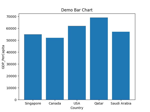
Line 1 to 5: We import the matplotlib.pyplot package. We also created two lists (Country, GDP_PerCapita) for the x-axis and y-axis.
Line 7: We pass those two lists as parameters into the plt.bar () method.
Line 8 to 11: We set the x-axis and y-axis label names. We also set the title name of the bar chart and, at last, we plot the graph which shows in the above.
The above method is the default method, and we just pass our x-axis and y-axis. But we can also color our graph and format. That’s all we are going to see ahead.
Example 2: Bar charts with custom width of the rectangle bar
We can also change the width of the bar chart. The default bar chart width is 0.8, but if we need some less width of the rectangle bar, we can decrease the width value. And the same, we can increase the value from 0.8 to greater if we need to increase the width of the bar. So, in this, we are going to see this width parameter. We are going to use the same python code as shown in example 1.
# import the matplotlib.pyplot package
importmatplotlib.pyplotasplt
# Created two lists for x-axis and y-axis
Country = ['Singapore','Canada','USA','Qatar','Saudi Arabia']
GDP_PerCapita= [55000,52000,62000,69000,57000]
# pass both lists into the bar() method and here we change the width size
#value from 0.8 (default) to 0.5
plt.bar(Country, GDP_PerCapita,width=0.5)
# set the title name
plt.title('Demo Bar Chart width size')
# set the xlable name
plt.xlabel('Country')
# set the ylabel name
plt.ylabel('GDP_PerCapita')
# draw the graph
plt.show()
Line 4 to 8: We import the matplotlib.pyplot package. We also created two lists (Country, GDP_PerCapita) for the x-axis and y-axis.
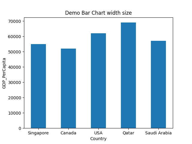
Line 11: We pass those two lists as parameters into the plt.bar () method. We also set the width=0.5. This value changes the default width value, which is 0.8.
Line 14 to 23: We set the x-axis and y-axis label names. We also set the title name of the bar chart and, at last, we plot the graph which shows below. The below bar chart width size is now decreased.
Output: bar_chart_width.py
The below bar chart is the output. We can see that now the bar chart width size is thinner than the example_1 bar chart output.
Example 3: Change the color of the bar chart
We can also change the colour of the bar chart. For that, we have to pass any colour name with the keyword color = colour_name into the bar () method, as shown below. This will change the colour of the bar chart from the default colour to the passed colour name.
# import the matplotlib.pyplot package
importmatplotlib.pyplotasplt
# Created two lists for x-axis and y-axis
Country = ['Singapore','Canada','USA','Qatar','Saudi Arabia']
GDP_PerCapita= [55000,52000,62000,69000,57000]
# pass both lists into the bar() method, and here we change the width
# size value from 0.8 (default) to 0.5 and the color=green
plt.bar(Country, GDP_PerCapita,width=0.5,color='green')
# set the title name
plt.title('Demo Bar Chart change the colour')
# set the xlable name
plt.xlabel('Country')
# set the ylabel name
plt.ylabel('GDP_PerCapita')
# draw the graph
plt.show()
Line 4 to 8: We import the matplotlib.pyplot package. We also created two lists (Country, GDP_PerCapita) for the x-axis and y-axis.
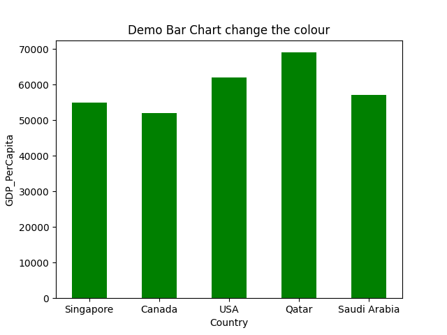
Line 13: We pass those two lists as parameters into the plt.bar () method. We also set the width=0.5. This value changes the default width value, which is 0.8. We passed one more parameter color. This color parameter helps us to change the colour of the bar chart graph.
Line 16 to 25: We set the x-axis and y-axis label names. We also set the title name of the bar chart and, at last, we plot the graph which shows below. The below bar chart colour is now changed.
Output: bar_chart_change_color_1.py
The below bar chart is the output. We can see that now the bar chart colour is changed to green, which we passed. So, you can pass any colour, and the bar () method will display the graph with the same colour which you have passed into that.
Example 4: Change the colour of each bar chart
We can also change the colour of each rectangle bar chart. We have to make a list of colours that we want to apply and then pass that list to the bar () method with other parameters like the below code.
# import the matplotlib.pyplot package
importmatplotlib.pyplotasplt
# Created two lists for x-axis and y-axis
Country = ['Singapore','Canada','USA','Qatar','Saudi Arabia']
GDP_PerCapita= [55000,52000,62000,69000,57000]
colors= ['purple', 'gold', 'red', 'green', 'blue']
# pass both lists into the bar() method and here we change the width
# size value from 0.8 (default) to 0.5
plt.bar(Country, GDP_PerCapita,width=0.5,color=colors)
# set the title name
plt.title('Demo Bar Chart change color of each rectangle bar')
# set the xlable name
plt.xlabel('Country')
# set the ylabel name
plt.ylabel('GDP_PerCapita')
# draw the graph
plt.show()
Line 4 to 8: We import the matplotlib.pyplot package. We also created two lists (Country, GDP_PerCapita) for the x-axis and y-axis.
Line 9: We have created a different colour names list, and we will pass it into the bar () method as a parameter.
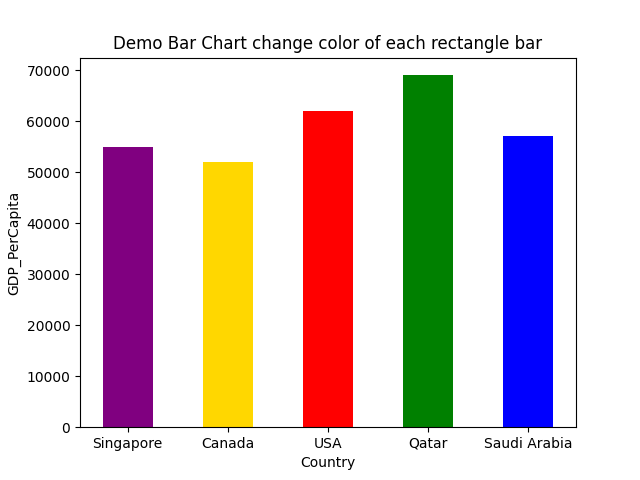
Line 13: We pass those two lists as parameters into the plt.bar () method. We also set the width=0.5. This value changes the default width value, which is 0.8. We passed one more parameter color. This color parameter helps us to change the colour of each bar chart graph.
Line 16 to 25: We set the x-axis and y-axis label names. We also set the title name of the bar chart and, at last, we plot the graph which shows below. The below bar chart width size is now decreased.
Output: bar_chart_change_color_2.py
The below bar chart is the output. The bar chart color is changed to different colors, not to a single colour according to the colour list values.
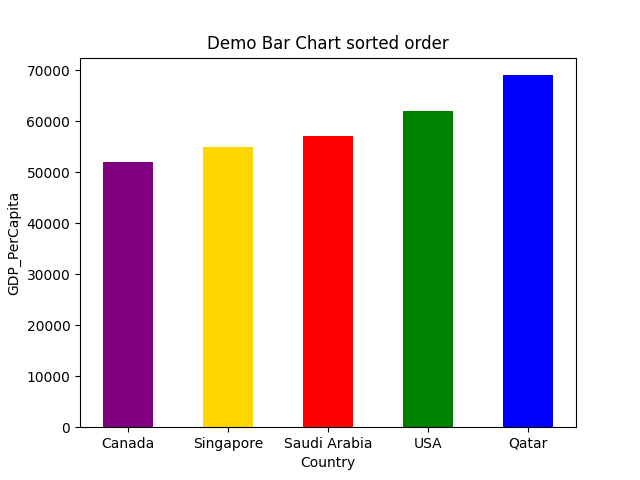
Example 5: Bar charts graph in sorted order
We can also display the bar chart graph in sorted order. For that, we have to sort the data before passing to the bar () method as shown below:
# import the matplotlib.pyplot package
importmatplotlib.pyplotasplt
# Created two lists for x-axis and y-axis
Country = ['Singapore','Canada','USA','Qatar','Saudi Arabia']
GDP_PerCapita= [55000,52000,62000,69000,57000]
colors= ['purple', 'gold', 'red', 'green', 'blue']
# Sort the lists
GDP_sorted=sorted(GDP_PerCapita)
Country_ordered= [x for _, x insorted(zip(GDP_PerCapita,Country ))]
print("Country_ordered", Country_ordered)
# pass both lists into the bar() method, and here we change the width
# size value from 0.8 (default) to 0.5
plt.bar(Country_ordered, GDP_sorted,width=0.5,color=colors)
# set the title name
plt.title('Demo Bar Chart sorted order')
# set the xlable name
plt.xlabel('Country')
# set the ylabel name
plt.ylabel('GDP_PerCapita')
# draw the graph
plt.show()
Line 4 to 8: We import the matplotlib.pyplot package. We also created two lists (Country, GDP_PerCapita) for the x-axis and y-axis.
Line 9: We have created a different colour names list, and we will pass it into the bar () method parameter.
Line 12 to 15: We first sort the GDP values of the country, and then we sort the country name according to their GDP value using the zip () method. And then, we print the country_ordered variable for confirmation, and we get the country name in a sorted order as shown below:
So, now we have both values in sorted order. So we are going to pass these sorted lists as parameters to the bar () method.
Line 20: We pass those two sorted lists as parameters into the plt.bar () method. We also set the width=0.5. This value changes the default width value, which is 0.8. We passed one more parameter color. This color parameter helps us to change the colour of each bar chart graph.
Line 23 to 32: We set the x-axis and y-axis label names. We also set the title name of the bar chart and, at last, we plot the graph which shows below. The below bar chart width size is now decreased.
Output: bar_chart_sorted_order.py
The below bar chart is the output. We can see that now the bar chart is in sorted order.
Example 6: Bar chart with Gridlines
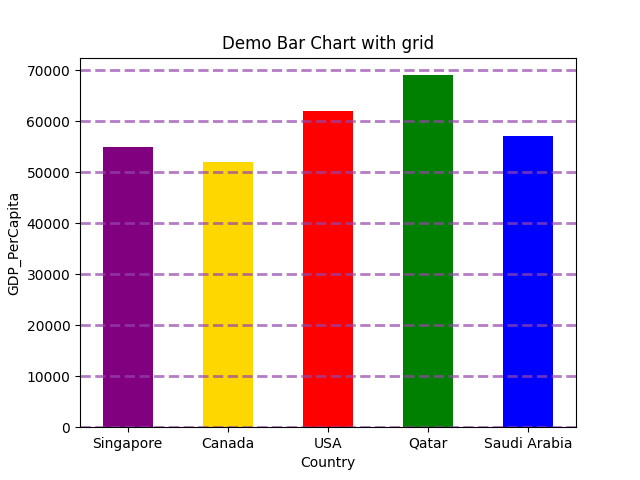
We can also add the grid lines in the bar chart using the grid () function. This grid line function also accepts different parameters like colour, linewidth, lifestyle, etc. So we are going to implement the same code with the grid () function.
# import the matplotlib.pyplot package
importmatplotlib.pyplotasplt
# Created two lists for x-axis and y-axis
Country = ['Singapore','Canada','USA','Qatar','Saudi Arabia']
GDP_PerCapita= [55000,52000,62000,69000,57000]
colors= ['purple', 'gold', 'red', 'green', 'blue']
# pass both lists into the bar() method and here we change the width
# size value from 0.8 (default) to 0.5
plt.bar(Country, GDP_PerCapita,width=0.5,color=colors)
plt.grid(color='#9545ab', linestyle='--', linewidth=2, axis='y', alpha=0.7)
# set the title name
plt.title('Demo Bar Chart with grid')
# set the xlable name
plt.xlabel('Country')
# set the ylabel name
plt.ylabel('GDP_PerCapita')
# draw the graph
plt.show()
The above code is similar to example no. 4. The only change is in the above python code is at line number 14. In line 14, we added one grid () function, and inside of that, we pass different line parameters.
And when we run the above code, we get the output like below:
Example 7: Horizontal bar chart
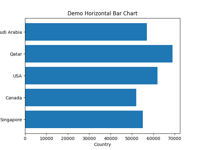
We can also horizontally display the bar chart. For that, we have to use plt.barh instead of plt.bar
# import the required package
importmatplotlib.pyplotasplt
# created two dummy lists for x-axis and y-axis
Country = ['Singapore','Canada','USA','Qatar','Saudi Arabia']
GDP_PerCapita= [55000,52000,62000,69000,57000]
# we using here barh () method (horizontal) not bar () method
plt.barh(Country, GDP_PerCapita)
# set the title of the bar chart
plt.title('Demo Horizontal Bar Chart')
# set the xlable and ylabel of the bar chart
plt.xlabel('Country')
plt.ylabel('GDP_PerCapita')
# finally display the graph
plt.show()
Line 11: we are using the plt.barh () method for the horizontal.
The below output shows the above code.
Output: horizontal_demo.py
Conclusion: This article has shown how to create the bar chart from the matplotlib.pyplot. We have also seen different parameters which we can use in the bar () function. These parameters can make our graph look very professional, like changing the color, width of the bar, horizontal or vertical display, etc. In the next article, we explore more about matplotlib.
The code for this article is available at the below github link:
https://github.com/shekharpandey89/how-to-use-matplotlib-bar-chart
from Linux Hint https://ift.tt/3zUDVsd


0 Comments