In this tutorial, we will learn how we can create an area plot using the Plotly Express module.”
Let’s dive in.
Plotly.Express.Area
To create an area plot with Plotly Express, we use the area() function. The function syntax is as shown below:
pattern_shape=None, symbol=None, hover_name=None, hover_data=None,
custom_data=None, text=None, facet_row=None, facet_col=None, facet_col_wrap=0,
facet_row_spacing=None, facet_col_spacing=None, animation_frame=None,
animation_group=None, category_orders=None, labels=None,
color_discrete_sequence=None, color_discrete_map=None,
pattern_shape_sequence=None, pattern_shape_map=None, symbol_sequence=None,
symbol_map=None, markers=False, orientation=None, groupnorm=None, log_x=False,
log_y=False, range_x=None, range_y=None, line_shape=None, title=None,
template=None, width=None, height=None)
The following are the most important parameters you will need to know:
- Data_frame – specifies the column names for the plot. Either as a DataFrame, array_like object, or a dictionary.
- X – defines the values used as marks along the x-axis along the cartesian coordinate. This can be a name of a column within a data frame, a Pandas Series, or an array_like object.
- Y – similar to x but specifies the marks used along the y axis.
- Color – species the values used for color marks. It can be a column name, a pandas series, or an array object.
The function returns an area plot of type graph_objects.Figure.
Example 1
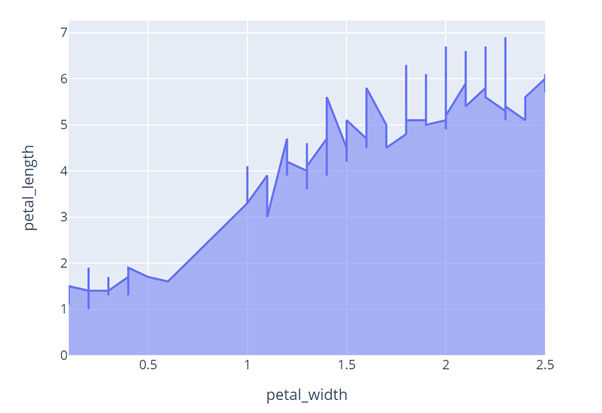
The code below shows how to use the area() function from the Plotly express module to create a simple area graph.
df = px.data.iris()
fig = px.area(df, x='petal_width', y='petal_length')
fig.show()
The code above will fetch the iris data from plotly and create an area t plot with the specified x and y values.
The resulting figure is as shown:

Example 2
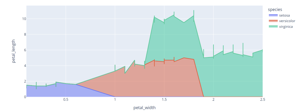
We can specify the color parameter as a column within the iris dataframe as shown in the code below:
df = px.data.iris()
fig = px.area(df, x='petal_width', y='petal_length', color='species')
fig.show()
In this case, the function returns an area plot as shown:

Example 3
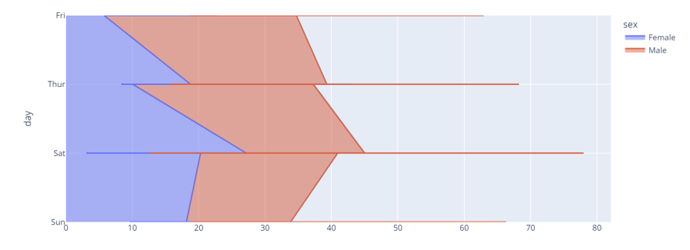
Take another example shown below:
df = px.data.tips()
fig = px.area(df, x='total_bill', y='day', color='sex')
fig.show()
Here, we are using the tips data from plotly express and setting the color value to the column “sex”.
The code above should return a figure as shown:

And that’s all there is to area plots using plotly express.
Thanks for reading!!
from https://ift.tt/89v3XCN


0 Comments