A Cascading Style Sheet, CSS is the style code consisting of tags that are used to add style to the HTML contents that are created by using the HTML tags. HTML and CSS are known to have an importance in creating and designing the front-end of the websites. A CSS sheet contains several properties that are applied to each HTML content in specific ways. The basic HTML content is the “text”. As we know, whenever we see any website or a webpage, texts are always present on it either in the form of a paragraph, heading, or any link.
We have also seen the expanded letters of a single word to align with any other sentence equally. This is all because of a CSS property related to the text. This article will explain the HTML content text and one of the properties that we need to apply to the text which is font kerning.
Introduction to HTML and CSS
An HTML tag contains two sections: a head <head> and a body <body>. All the HTML contents are written inside the body section of the HTML tags. HTML contains mostly content that has both opening and closing tags.
Talking CSS is derived from its three types: inline, internal and external CSS. The internal CSS is declared in the head section of the HTML body. Its further explanation is applied at the time of the implementation. Similarly, the font kerning property is applied in the style tag of the head. While the text is declared inside the body section in the form of a paragraph or heading.
CSS Kerning Property of Font
A font kerning is the property that is related to the text. A font property is the text style that includes color, font style, alignment, etc. Similarly, kerning is one of the properties of CSS text. It is applied to the letters of the word of any sentence. It explains how much the letters of a word are spaced. The value of the kerning can be a positive sign or a negative sign.
- Positive value: A positive value of letter spacing makes the letter characters spread or expand farther apart. The space between two letters is increased by the value that we apply.
- Negative value: A negative sign with a value of the letter spacing brings the character close to one another by minimizing or excluding the distance between character to character equally.
A letter spacing value can be provided in different units. For example, the values are given in pixels, em, and in a normal situation. Each unit has a different effect. The normal value has the least space difference as compared with the font without any kerning effect. The effect of the decimal value is more than the digit value. The syntax of this property is as follows:
Font-kerning: value;
Other than the font kerning, we can use the letter-spacing property as well. Now, we implement some examples to explain the concept of the font kerning.
Example 1: Difference With and Without Kerning
In this example, we used the letter spacing property with a normal value to check the difference between the characters that have not applied the kerning effect and those who applied this effect.
Consider the body section of the HTML code. Use a heading tag to declare a simple heading <h2>. Then, use the paragraph tags. Both the paragraphs are applied with the CSS class name. These names of classes are declared inside the head style tag that will be discussed later.
Similarly, the second paragraph tag is also declared.

In the style tag, we used both the cases that are declared in the paragraph tags. The kerning class contains all the font-related properties including the normal font-kerning property. This font-kerning property refers to the letter spacing value that is taken as normal. Next, the font family is applied as Serif and the size property is also applied to the text.
Font-kerning: normal;
Font-family: serif;
Font-size: 20px;
}
Whereas, on the concerning class, the font-kerning property is taken as none. This means that the text in this paragraph is declared without a change in the letter spacing of the words.
Font-kerning: none;
}
The rest of the properties remain the same.
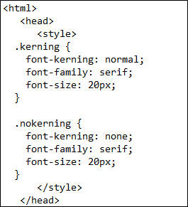
Save the code in the text file with an html extension. By doing this, we will see that the file icon is changed into the browser icon instead of the editor’s symbol. Execute that file in the chrome to see the output.

You will see that there is no effect in the first paragraph where we used the letter spacing property or the font-kerning effect as a normal value. When we compare the first paragraph with the second paragraph that has no kerning effect, we find no changes between them.
Example 2:
This example contains the different values of the letter spacing property. In the body tag, we used five paragraphs and each paragraph is declared with a different class. The name of the class discloses the working of the values that are applied at the time of declaration. In each class, a different value is used.
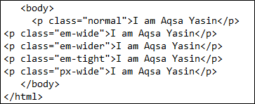
For instance, we use the “.em-wider” class with a 1em value. This makes the text wider than the others. While the -0.09em causes the text to become tighter.
Letter-spacing: -0.09em;
}
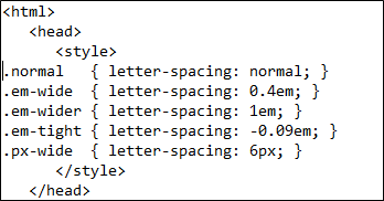
Now, save the code and we will see the result. All the lines are displayed with the different letter spacing between them. The first paragraph is the normal one. The fourth paragraph with a negative decimal value brought the letters close to each other.

Example 3:
This example involves the property of the first line. As the name indicates, the property is implemented on the first line. An inline style is applied to those who have the width property.
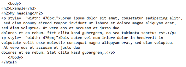
The style tag contains the paragraph first line tag which shows that only the first line of both paragraphs are affected.
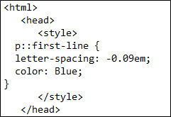
P :: first-line {
Letter-spacing: -0.09em;
Color: blue;
}
This property contains the letter spacing of a decimal negative value and font color to discriminate the first line from the rest of the lines.
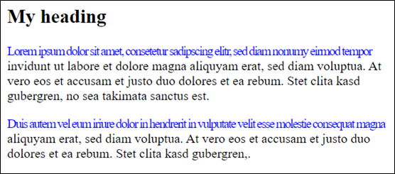
Upon execution, you will see that the first line is affected by the letter spacing property when the space between the letters is reduced.
Conclusion
The CSS font kerning article concluded that the space between the letters of the word can be reduced or increased by using a CSS property of font kerning or using the letter-spacing technique. We can apply this technique in more than a single unit. Moreover, in a positive and negative value, we are able to apply the values to this property. At the start, we have given a small introduction regarding the front-end languages, then the font-kerning property is explained along with the implemented examples that contain the font kerning of paragraphs in more than one possible way. Also, the first-line property is applied to one example.
from https://ift.tt/yU7WP9e


0 Comments