


The HTML layout elements define the layout of the page that how the elements are to be arranged to get a well-structured page. Whereas the HTML layout techniques beautify the elements to get a page in a presentable format. Keeping in view the importance of HTML elements and HTML techniques, this guide intends to provide the following learning outcomes:
- What are HTML layout elements
- CSS frameworks
- Grid layout
- Flexbox layout
- Float property
HTML layout elements
The HTML5 has come up with the support of various semantic elements that can be used to design the layout of the HTML page. One can use the semantic elements in an organized manner to get the desired layout. The following HTML elements are set to set the layout of the page accordingly.
<header>: The header section defines the header part of the document
<section>: This element is used to create a new section inside a page
<nav>: The <nav> element is practiced to create a set of links that could be used to navigate to various pages of a website.
<article>: An article inside an HTML page can be defined using this tag.
<aside>: The <aside> tag creates short information (could be a side note, or a sidebar) about any HTML element.
<summary>: This element creates a heading to summarize any information or detail about that heading. Upon clicking that heading, the information would be displayed that is stored inside it.
<details>: The <details> tag is used to mention detailed information about any specific thing/object.
<footer>: It represents the footer of a section/document.
To learn more about HTML semantic elements, click here.
HTML layout techniques
The HTML layout techniques assist in creating a multicolumn layout and the techniques may be chosen from one of the following provided here.
CSS frameworks
CSS frameworks would assist in creating a responsive and attractive layout of a web page. These frameworks include various built-in classes equipped with styles thus you do not need to create your own styles. Among various CSS frameworks, W3.CSS and Bootstrap are widely used.
How to use the W3.CSS framework
It is a well-defined modern CSS framework supposed to provide high functionality of styles for a web page. Its purpose is to provide a diverse alternative to the Bootstrap framework. To use the w3.css class, you have to just insert the following link to your HTML page.
How to use the Bootstrap framework
The bootstrap framework is another CSS framework that also has built-in classes to provide various kinds of styles to HTML pages. To use the Bootstrap framework, you have two possibilities:
– download Bootstrap
– use the CDN link directly in your HTML document (recommended)
The following CDN links assist you in importing Bootstrap instances to style your web page.
Paste the following link in your head tag (recommended)
Place the following script at the end (recommended) of the <body> tag of the document
By placing the above links, you would be able to use various Bootstrap classes to style your HTML page accordingly.
CSS float
This technique is quite helpful in placing HTML elements. By default, the elements are placed one after another. However, you can use the float/clear property to manipulate the default placement of elements. The clear property is used to break the continuity of the float property, such that if you want to place the element on the next line then you have to use the clear property.
The functionality of CSS float and clear properties is easy to learn but tricky to implement. The following example refers to the usage of float and clear properties.
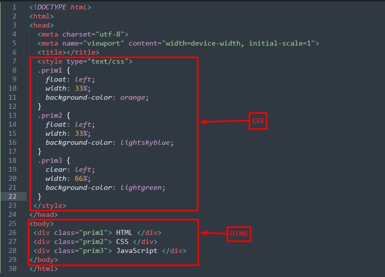
HTML
The above HTML code creates three divisions with class names “prim1“, “prim2” and “prim3“.
CSS
float: left;
width: 33%;
background-color: orange;
}
.prim2 {
float: left;
width: 33%;
background-color: lightskyblue;
}
.prim3 {
clear: left;
width: 66%;
background-color: lightgreen;
}
The main ingredient of this example is the CSS that shows how the float and clear properties are used. The float=”left” property is used in the first two divs whereas the third div has the clear=”left“.
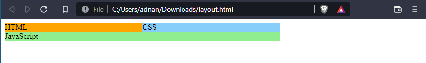
Output
Flexbox layout
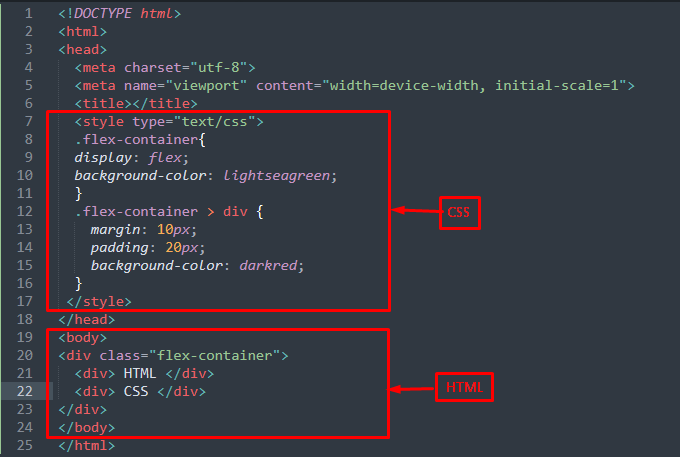
The CSS flexbox (flexible box) module assists in creating a flexible layout structure without using the float or any positioning element. Moreover, the elements can be arranged in a row or a column (one dimension only). To use the CSS flexbox technique, you have to add class=”flex-container” to the element and the “display” property of flex-container must be set to “flex“. The child elements do not require any class, they are just adjusted with the parent class.
The example provided below better demonstrates the usage of a flexible layout.
In the above code, a div is created with class=”flex-container” and its display property is set to “flex”.
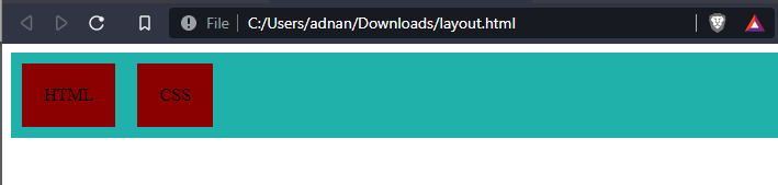
Output
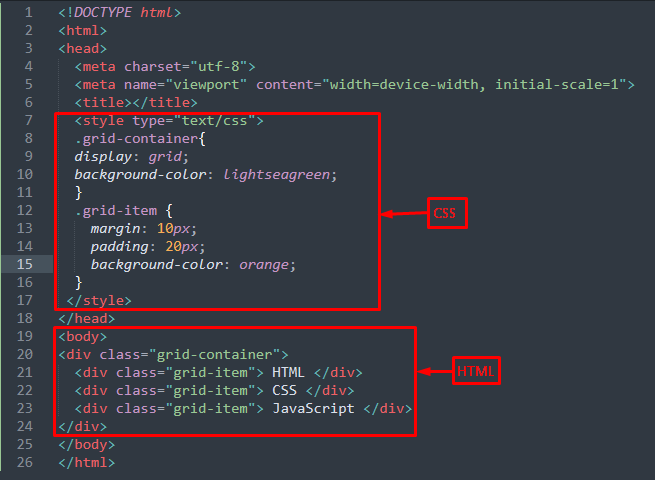
Grid layout
The grid layout allows arranging various child elements in a presentable manner. The grid layout offers the arrangement in two dimensions (with row and column simultaneously). To use this, the class=”grid-container” is used for the parent element whereas the class=”grid-item” is used for the child elements. Moreover, the display property of the grid container may be set to the grid or to inline-grid.
In the above code, the class of parent div is set to “grid-container” and the child items have classes “grid-item“.
Output
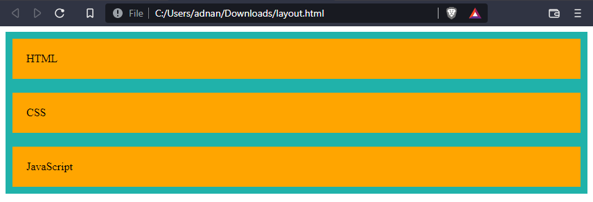
The output shows the primary difference between grid and flex layout. The grid layout has been expanded in multi-dimension whereas the flex layout arranges the elements in a single dimension.
Conclusion
HTML layout elements and HTML layout techniques provide the functionality to design a web page in a presentable manner. For this, various HTML semantic elements and HTML layouts are provided in this article. The semantic elements best serve the purpose of their usage and thus are considered to be an important ingredient of the web page. The HTML layout techniques may include CSS frameworks (Bootstrap or W3.css), CSS float, CSS flexible box, and CSS grid.
from https://ift.tt/N9VqcQ3


0 Comments