


CSS Box Shadow
For the purpose of adding shadows to various HTML elements, use the box-shadow property. Below we have demonstrated various ways that you can use to add shadow to your HTML elements.
Add Horizontal and Vertical Shadow
To add a shadow effect on a certain element horizontally and vertically simply give values to both the dimensions of the box-shadow property. Consider the following example.
HTML
Here we are simply creating a div element to demonstrate the concept of the box-shadow effect.
CSS
width: 250px;
height: 150px;
padding: 10px;
background-color: bisque;
box-shadow: 9px 9px;
}
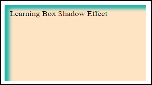
Using CSS, we are providing some width, height, padding and background color to the div element. Lastly, using the box-shadow property we have given 9px to both horizontal and vertical dimensions of the shadow. Note that the shadow will have the same color as the text present inside the div element.
Output
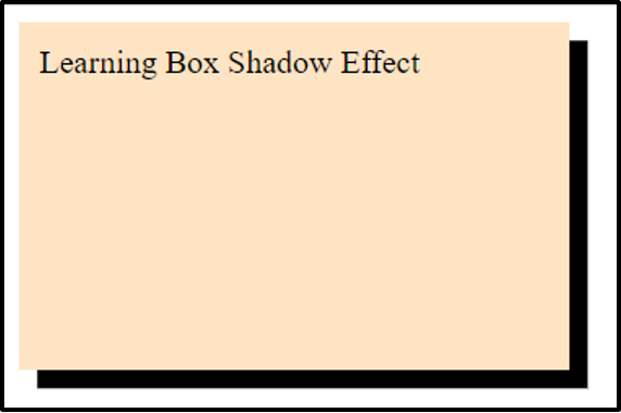
A horizontal and vertical shadow was added to the div container.
Adding color to the shadow
As already mentioned, by default the color of the shadow will be the same as that of the content present inside the element, however, you can change its color by specifying it in the box-shadow property. Use the following code snippet.
CSS
box-shadow: 9px 9px lightseagreen;
}
Here we have specified the color of the shadow.
Output
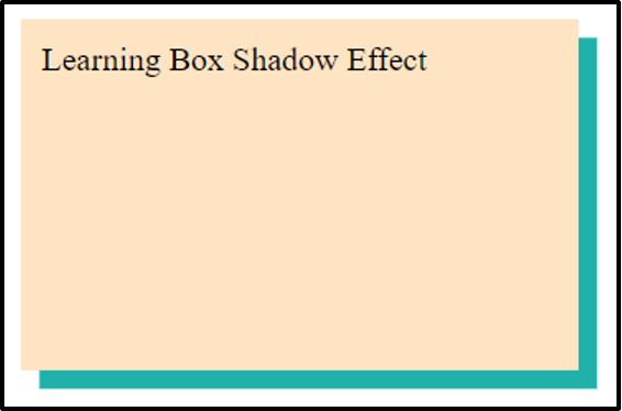
A lightseagreen shadow was added to the box.
Add a blur effect to the shadow
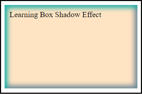
For the purpose of adding blur to the shadow, specify the blur intensity in the box-shadow property. Follow the example below.
CSS
box-shadow: 9px 9px 7px rgb(32, 178, 170);
}
We have set the blur intensity to 7px. Note that the blur effect enhances as you increase the blur intensity.
Output
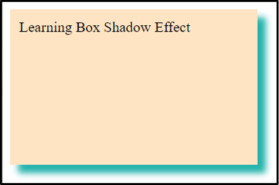
A blur effect was added successfully.
Alter the size of the shadow
In order to alter the size of the shadow you can specify the spread intensity of the shadow. The spread intensity basically defines the spread of the shadow rather than the size. Here is how you do it.
CSS
box-shadow: 9px 9px 7px 10px lightseagreen;
}
In the above code, first we have set the horizontal and vertical dimensions of the shadow to 9px then we have set the blur intensity to 7px and lastly specified the spread intensity as 10px.
Output
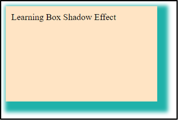
A shadow with a specific spread intensity is applied as desired.
Note: In order to decrease the spread of the shadow, assign negative values to the spread radius.
All the examples mentioned above are demonstrating how to add an outer shadow to an element. However, you can also add an inner shadow to an element.
Add an inner shadow
For this purpose, simply insert an inset parameter to the box-shadow property. Follow the code snippet below:
CSS
box-shadow: inset 9px 9px 7px lightseagreen;
}
Apart from defining the size, blur radius and color of the shadow, we have transformed the outer shadow to an inner one using “inset”.
Output
An inner shadow was added successfully.
Adding multiple shadows
To add numerous shadows on an element, you can add a list of shadows to the box-shadow property separated by commas. Here is an example.
CSS
box-shadow: 6px 6px lightseagreen, 8px 8px lightsalmon, 12px 12px lightskyblue;
}
Here we are adding three different shadows, each shadow having a specific size and color.
Output
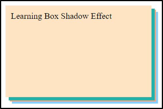
Multiple shadows were added successfully.
Having the knowledge of spread radius, inner shadow, and multiple shadows you can do another fun thing with shadows. Consider the example below.
CSS
box-shadow: inset 6px 6px 10px lightseagreen,
inset -6px -6px 10px lightslategrey;
}
In the above code, we are adding two inner shadows on the same element but both the shadows have different positions and colors.
Output
Two inner shadows have successfully been added.
Conclusion
For the purpose of adding a shadow to the HTML element, the CSS box-shadow property is used. You have to specify the length of the horizontal as well as the vertical dimension of the shadow in the box-shadow property. You can also add color, and a blur effect to the shadow of an element. Apart from this, the box-shadow property allows you to enhance the spread of a shadow or add an inner shadow to an element. This tutorial is designed to guide you about various ways that can be used to add a shadow to an element.
from https://ift.tt/ApUyHVP


0 Comments