


In this guide, however, we are going to stick to the 2D transform and learn about the various 2D transformation methods.
2D Transformation Methods in CSS
There are various 2D transformation methods in CSS which are as follows.
- translate() Method
- rotate() Method
- scale() Method
- scaleX() Method
- scaleY() Method
- skew() Method
- skewX() Method
- skewY() Method
- matrix() Method
These are explained in detail below.
translate() Method
The CSS translate() method alters the position of an element along the x-axis (horizontally) or along the y-axis (vertically) based on the parameters assigned.
Syntax
Or,
The tx, and ty refer to the x, and y axes.
Example
Suppose you want to move an image to a certain position using the translate() method then follow the example below.
HTML
CSS
width: 250px;
height: 100px;
transform: translate(50px, 50px);
}
Output
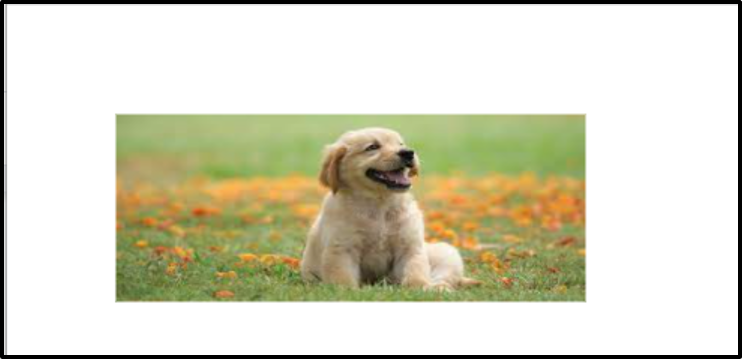
Without translate() method.
With translate() method.
The translate() method has translate the image 50px from the top and 5-px from the left side successfully.
rotate() Method
For the purpose of rotating an element clockwise or anti-clockwise based on the degree specified, the rotate() method is used.
Syntax
The degrees parameter defines the angle from which the element should be rotated.
Example
Consider the example below to understand the working of the rotate() method.
HTML
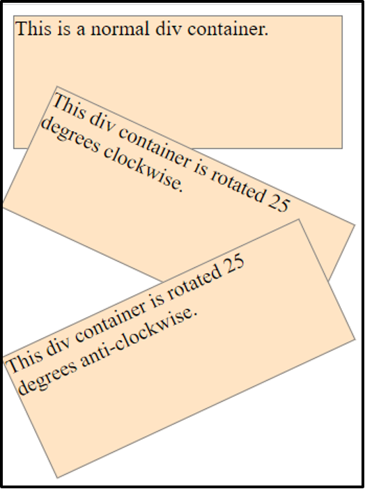
Here we have specified three div containers to demonstrate the concept of the rotate() method.
CSS
width: 250px;
height: 100px;
background-color: bisque;
border: 1px solid gray;
}
.clockwise {
transform: rotate(25deg);
}
.anticlockwise {
transform: rotate(-25deg);
}
In the above code, we are first giving some width, height, background color, and border to the div containers. Afterward, we are rotating the second div 25 degrees clockwise and the third div 25 degrees anti-clockwise. Note that to rotate anti-clockwise we are using negative values.
Output
The rotate() method has been implemented and verified.
scale() Method
In order to enhance or reduce the size of an element based on the specified width, and height the scale() method is used.
Syntax
Or,
The sx, and sy represent the horizontal and vertical dimensions respectively.
Example
The example below demonstrates the working of the scale() method.
HTML
In the above code, we have simply created a div element.
CSS
width: 200px;
height: 100px;
margin: 130px;
background-color: bisque;
border: 1px solid black;
transform: scale(2,2);
}
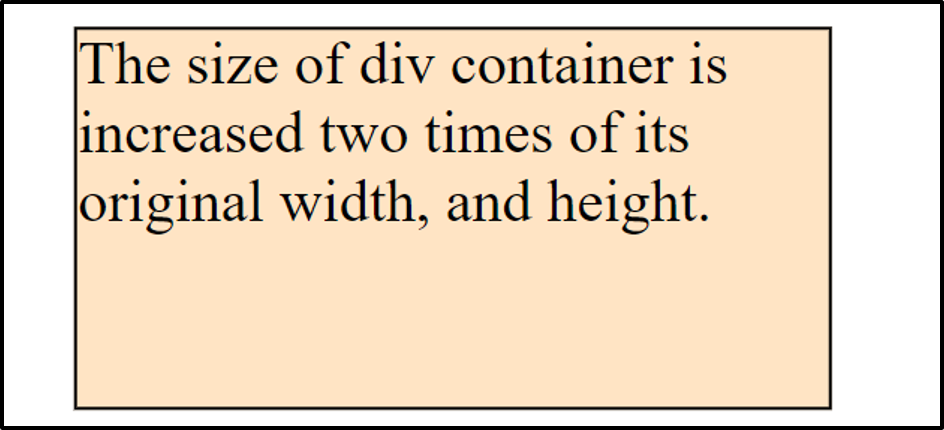
Using CSS properties we are assigning some width, height, and margin to the div element and lastly we are using the scale() method to increase the width and height of the element twice its original width and height.
Output
The size of the div container was increased using the scale() method.
scaleX() Method
For the purpose of altering the width of an element, the scaleX() method is used.
Syntax
The sx parameter represents the horizontal dimension of an element.
Example
Let’s say you want to decrease the width of an element then consult the example below.
CSS
transform: scaleX(0.5);
}
In above code, we are using the scaleX() method to decrease the width of a div container.
Output
The scaleX() method is working properly.
scaleY() Method
For the purpose of altering the height of an element, the scaleY() method is used.
Syntax
The sy parameter defines the value of y-axis.
Example
Consider the example below.
CSS
transform: scaleY(2);
}
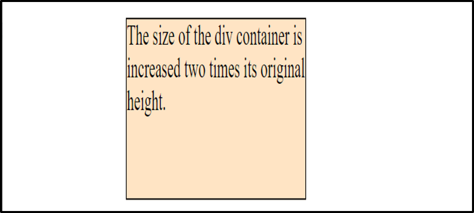
Here we are using the scaleY() method to increase the height of the div element.
Output
The height of the div element has been increased two times its original height.
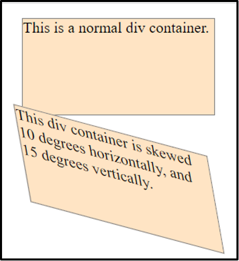
skew() Method
This method skews an element horizontally and vertically based on the degrees specified.
Syntax
Or,
The sx, and sy represent the x, and y axes.
Example
Suppose you wish to skew an element along x and y axes..
HTML
Here we have defined two div containers to demonstrate the working of the skew() method.
CSS
width: 200px;
height: 100px;
background-color: bisque;
border: 1px solid gray;
}
.skew {
transform: skew(10deg,15deg);
}
Apart from styling the div containers we are skewing the second div container 10 degrees along X-axis and 15 degrees along Y-axis.
Output
The div container has been skewed horizontally and vertically.
skewX() Method
In order to skew a particular element horizontally based on the degrees specified the skewX() method is used.
Syntax
The sx parameter defines the x-axis.
Example
Suppose you want to skew an element 15 degrees horizontally.
CSS
transform: skewX(15deg);
}
Using the skewX() method we are skewing the div element 15 degrees horizontally.
Output
The scaleX() method is working properly.
skewY() Method
In order to skew a particular element vertically based on the degrees specified the skewY() method is used.
Syntax
The sy parameter defines the y-axis.
Example
Suppose you want to skew an element 15 degrees vertically.
CSS
transform: skewY(15deg);
}
Using the skewX() method we are skewing the div element 15 degrees vertically.
Output
The scaleY() method is working properly.
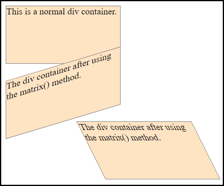
matrix() Method
For the purpose of translating, rotating, scaling, and skewing elements all at once, the matrix() method is used.
Syntax
You can assign values to all the properties separating them commas.
Example
Let’s understand the working of the matrix() method using the following example.
HTML
To demonstrate the working of the matrix() method we have created three div elements.
CSS
width: 200px;
height: 100px;
background-color: bisque;
border: 1px solid gray;
}
.matrix1 {
transform: matrix(1, -0.3, 0, 1, 0, 0);
}
.matrix2 {
transform: matrix(1, 0, 0.5, 1, 150, 0);
}
We are assigning different values to various parameters of the matrix() method.
Output
The matrix method is working properly.
Conclusion
For the purpose of positioning, rotating, scaling, or skewing elements along the X and Y axis there are various 2D transformation methods available in CSS. The basic 2D transformation methods in CSS are translate(), rotate(), scale(), skew(), and matrix(). Each of these methods serve a different purpose which we have explained in this article along with relevant example.
from https://ift.tt/rTfiSaq


0 Comments